I’ll start with the things I know about this task..
1. We want a good quality - good looking/comforatable hat with the Devonleigh logo on it primarily for are tradespeople.
2. We want a “charcoal” coloured hat or a variation of charcoal
3. We want the logo to be embroidered onto the hat
The biggest challenge has been the logo. I know it’s come up time and time again but this continues to produce issues from a digital standpoint and a merchandising standpoint.
The main ongoing issue with the logo has been the leafage in front of the "D". It simply just gets in the way and makes things very complex when embroidery is needed. Also from a digital standpoint it is very difficult to interpret what the logo is when it is shown at a small size.
The gradient in the logo (yellow and white) also produces similar issues.
To me, the most identifiable components of the Devonleigh logo from a brand standpoint is the teal colour and the “D”. The leafage and the gold/yellow/brown colours that are used in the leafage and frames takes away from that.
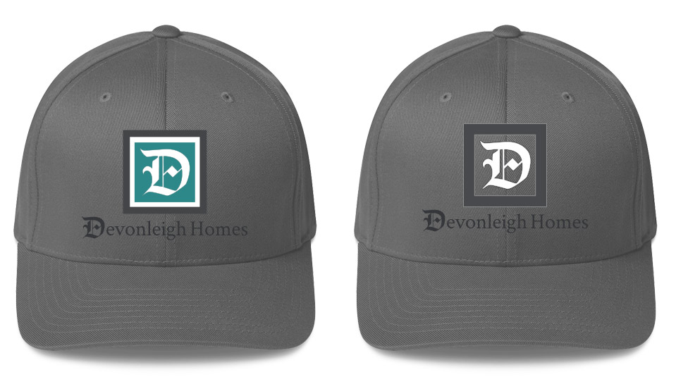
My goal in the images below was to help draw out the 2 main components of the logo. It should be kept in mind that when wearing company merchandise, you have to take into account how people move while wearing the merchandise and that it may be worn during a bright day or at night. I think these 2 concepts make it possible to always identify from any reasonable distance what the logo is. Any version with the leafage in front of it makes visibility a lot more challenging

Another big thing to remember is how the teal colour is going to be used. Putting something in teal on top of a charcoal colour will not work on its own. Putting teal wording on charcoal becomes unreadable from a certain distance.
I also believe that the gold/yellow frame and gradient does not compliment the teal colour (especially with charcoal) and adds another layer of complexity that isn’t needed.
If you look at the image below, you’ll see 2 colour palettes. Each row’s first colour is roughly the colour of the hat.

The first row is all the colours included in your logo. From a colour theory standpoint, the gold/yellow doesn’t compliment the other colours collectively. I do believe that without it being obvious to you, it has played a big part in how you see things visually when you’re trying to come up with merchandising.
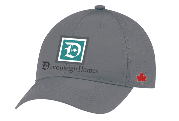
So with the teal logo above, I’m using the white frame to help enhance a white “D” and believe overall helps these 2 brand components stand out more The logo with no teal is another appealing option as well (I think) - where the focus in on the D itself inside a transparent frame. From an embroidery standpoint, it includes a white very thin stitch around the dark frame to subtly support the white “D”. The “D” would also have a very thin dark stick around it which would also help enhance the “D”. The next set of images are very rough drafts of the teal logo in use. Please keep in mind that the colours of the hats are different. Depending on who you are getting to do this, slight changes will have to be applied depending on the exact colour of the hat. I personally would recommend AJM International - from where these specific hat images are from. I believe this hat is exactly or very similar to the one you showed me.
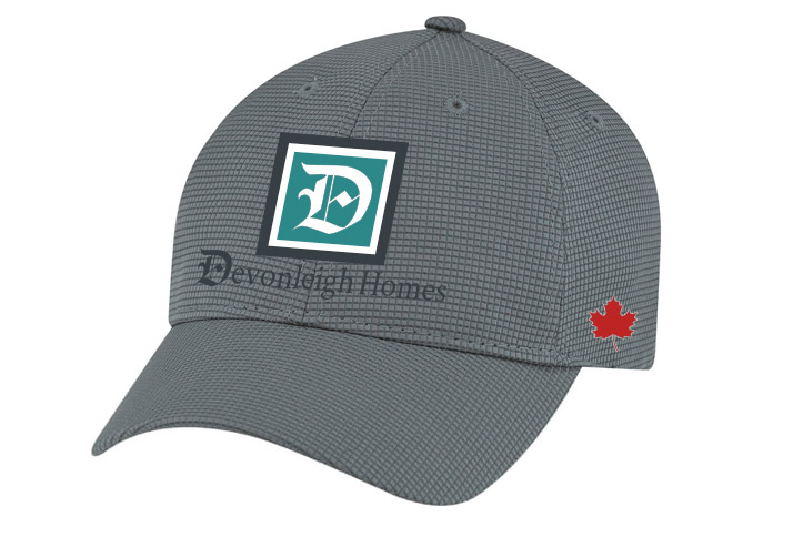
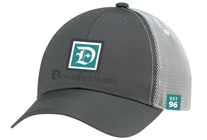
This is a hat that’s available that I just thought was a bit more interesting and apparently it’s really comfortable (primarily for golfing). I thought that with a bit of a pattern that it could make for a more appealing hat. This is my personal favourite. It’s very similar to a New Era 39Thirty hat. I have the exact hat for the San Antonio Spurs. But what I like about this hat is the 2 colours - especially that the white another element that helps support the white “D” in a very positive way. You’ll also notice the “EST 96”. AJM can provide this woven label to any hat. You can see the product here. I think you can put this label on one side and the Canadian leaf on the other.
Hat One

Hat Two

Hat Three
